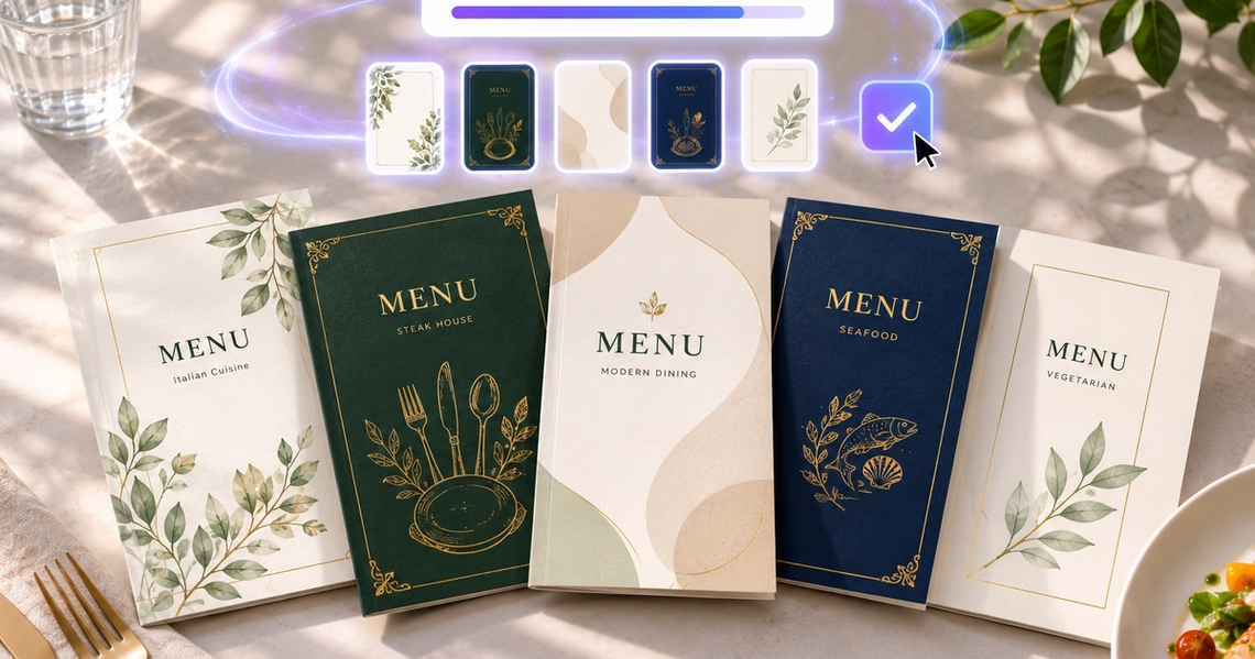
A menu is the most-read piece of design any restaurant owns, and the one most often left to whatever template came with the printer. It is also the hardest hospitality artefact to generate, because a menu is not a picture — it is a reading surface. Good AI menu prompts describe where the dishes and prices will sit before they describe how it looks.
The 45 below cover restaurants, cafés, bars, fine dining, takeaway and seasonal formats. Each names a size, a structure and the space reserved for text. Paste them into an AI menu generator or any text to image tool, then set your real dish names and prices in a design tool.
How to Write an AI Menu Prompt That Works
Never ask the model to render dish names or prices. Image models produce unreliable typography, and a menu with a mangled price is not a design problem — it is a trading problem. Ask for the layout structure with deliberate empty zones, then set the type yourself. Every prompt below is written that way.
Three habits raise the quality. Name the physical format — A4 single sheet, folded card, chalkboard, laminated table card — because each has different structural needs. Specify the number of sections and roughly how many lines each holds, so the layout has the right proportions rather than generic ones. And describe the reading conditions: a menu read in dim evening light needs far higher contrast than one read at a sunlit pavement table.
Two practical points before you print. Keep contrast high and type generous — menus are read by people of every age in poor light, and a design that is beautiful but unreadable costs orders. And check the legal requirements that apply where you trade: allergen information, calorie labelling and price display rules differ by country and change, so verify them with a current source rather than trusting a layout template.
Eight prompts for full-service dining. Each specifies a section structure, because the number of courses and how many dishes sit under each is what actually determines the proportions of the page.
1. Rustic Italian trattoria
A4 portrait menu design, rustic Italian trattoria. Warm cream paper texture with a subtle deckle edge, one thin olive-green rule dividing four sections of roughly five lines each. A small hand-drawn ink sprig in the upper corner as the only ornament. Generous line spacing, wide margins. Everything else left empty for dish names and prices. No text rendered.
2. Modern bistro, two columns
A4 portrait menu, contemporary bistro. Clean two-column grid with a clear vertical gutter, three sections per column separated by generous white space rather than rules. Palette of off-white, charcoal and one muted accent. Modernist restraint, no illustration at all. Column widths sized for dish name on the left and price aligned right. No text rendered.
3. Neighbourhood family restaurant
A4 portrait menu, welcoming family restaurant. Warm cream ground with a soft coloured border, five clearly separated sections with a coloured band heading each one. High contrast, large clear type areas, nothing decorative competing with the listings. Readable across a wide age range. No text rendered, no photographs of food.
4. Asian fusion, dark ground
A4 portrait menu, modern Asian fusion restaurant. Deep charcoal ground with reversed-out pale type areas, one warm brass accent line. Four sections of unequal depth. A subtle textural pattern confined to the top band only. Contrast high enough to stay legible in low evening light. No text rendered.
5. Seafood restaurant
A4 portrait menu, coastal seafood restaurant. Pale blue-grey ground with a fine linear pattern suggesting water confined to the header, deep navy type areas below. Three sections with a wide band at the base for a daily catch listing. Nautical without cliché — no rope borders, no anchors. No text rendered.
6. Steakhouse
A4 portrait menu, traditional steakhouse. Heavy dark ground with a wood or leather texture at low opacity, warm cream type areas, one gold rule. Three sections with the central one given twice the depth of the others for the main cuts. Solid, confident, unhurried. No text rendered, no photographs.
7. Plant-based restaurant
A4 portrait menu, plant-based restaurant. Natural recycled paper texture, muted palette of sage, clay and cream. Fine botanical line illustrations confined to the outer margins as a light frame. Four sections with generous spacing and a narrow column on the right reserved for dietary markers. No text rendered.
8. Folded card menu
A flat artwork for a three-panel folded card menu, shown unfolded with the two fold lines visible as faint guides. Each panel carries a distinct section with its own header band. Consistent margins across all three panels so the design survives folding. Two colours plus paper white. No text rendered.
Eight prompts for counter service. These are read standing up, from a distance, by someone deciding in about ten seconds — so hierarchy and contrast matter far more than detail.
9. Chalkboard wall menu
Wide landscape chalkboard menu design for a wall behind a counter. Deep matte black ground with visible chalk dust texture, three columns divided by faint vertical chalk rules, one bordered box in the lower right for a daily special. Type areas left empty. Legible from five metres. No text rendered.
10. Speciality coffee list
A5 portrait menu card, speciality coffee. Extremely minimal: warm off-white ground, one thin horizontal rule, two sections — espresso-based on the left, filter on the right. No illustration, no icons. Generous margins and wide line spacing. The restraint signals quality. No text rendered.
11. Brunch menu
A4 portrait brunch menu. Bright airy design on warm white, one soft watercolour wash across the top third as a header field, four sections below with clear headings. Palette of pale peach, sage and charcoal. Cheerful without being twee. Right column reserved for prices. No text rendered, no food photography.
12. Bakery counter card
A5 landscape counter card for a bakery. Kraft paper ground with a single ink colour, a loose hand-drawn wheat motif in one corner, a simple two-column list structure. Feels printed on a small press. Deliberately unpolished. Large clear areas for item names and prices. No text rendered.
13. Tea house menu
A5 portrait menu, calm tea house. Textured pale paper, a single fine line illustration of a leaf at the head, four sections separated only by white space. Muted palette of stone, jade and ink. Very generous margins, unhurried spacing. A narrow column on the right for steeping times. No text rendered.
14. Juice and smoothie bar
Vertical digital screen menu for a juice bar, 9:16 ratio. Bright flat colour blocks stacked vertically, each block a section with a bold coloured header band. High saturation, high contrast, designed for a backlit screen. Three sections. Nothing small or fine — everything legible at a glance. No text rendered.
15. Ice cream parlour
A3 portrait board menu for an ice cream shop. Playful flat design with a pastel palette and a scalloped border, a grid of empty circular swatches down the left edge where flavour colours will sit, listing area to the right. Cheerful but organised. No text rendered, no cartoon characters.
16. Counter A-board
Portrait pavement A-board menu design. Very high contrast, one bold colour field at the top for a headline, a large open area beneath for three or four handwritten lines, and a narrow strip at the base. Designed to be read from three metres in daylight. Weather-resistant simplicity, nothing fine. No text rendered.
Eight prompts for drinks lists. These are almost always read in low light, so every one specifies contrast rather than leaving it to the model — a dark menu with mid-grey type is the most common failure in the category.
17. Cocktail bar list
A5 portrait cocktail menu. Deep near-black ground with warm cream type areas at high contrast for low-light reading. Four sections of roughly four lines each, separated by thin brass rules. One small geometric motif at the head. Narrow right column for prices. Elegant, restrained, no illustration of drinks. No text rendered.
18. Wine list
A4 portrait wine list. Warm off-white ground, classical restraint, four sections by style with a wide left column for the wine name and region and two narrow right columns for glass and bottle prices. Fine hairline rules between entries. No illustration, no vineyard photography. Column widths are the whole design. No text rendered.
19. Craft beer board
Wide landscape draught board for a taproom. Dark ground with bold high-contrast type areas arranged in a grid: a wide column for the beer name, then narrow columns for style, strength and price. Six rows. One accent colour band across the header. Industrial and functional. No text rendered, no brewery logos.
20. Speakeasy menu
A5 portrait menu, hidden bar. Aged paper texture with a deckle edge, single dark ink, an ornamental border in a period engraving style confined to the outer margin. Two sections only, generous spacing. Deliberately sparse — the shortness of the list is the statement. No text rendered.
21. Rooftop bar, summer
A5 portrait drinks menu, rooftop bar. Warm gradient ground shifting from dusk orange to deep blue, cream type areas over the darker lower half only. Three sections. One thin gold rule. Contrast checked so the type areas stay legible against the gradient. Atmospheric but readable. No text rendered.
22. Table tent card
Flat artwork for a small double-sided table tent card, shown as two panels with the fold line visible. Each side carries a short promotional drinks list. Bold colour field at the top of each panel, clear listing area below. Compact and legible at close range. Two colours plus white. No text rendered.
23. Non-alcoholic list
A5 portrait menu for a considered non-alcoholic drinks list, designed with exactly the same seriousness as a cocktail menu rather than as an afterthought. Muted botanical palette, fine line detail at the head, three sections with generous spacing. No cutesy styling, no fruit illustrations. No text rendered.
24. Happy hour insert
Narrow portrait insert card sized to slot inside a larger menu. One bold saturated colour field with a large empty band across the centre for a headline and times, and a short listing area beneath. Designed to be swapped weekly and printed cheaply in one colour. No text rendered.
Seven prompts where restraint is the entire brief. Fine dining menus fail by adding — every one of these limits the palette, the elements and the number of lines deliberately.
25. Tasting menu, single column
A4 portrait tasting menu. One narrow centred column of eight evenly spaced type areas, each a single short line, on a heavy textured cream stock. Enormous margins on all four sides. No rules, no ornament, no colour beyond the paper and one ink. The white space is the luxury signal. No text rendered.
26. Chef's table card
Small square menu card for a chef's table. Deep matte ground with a single blind-embossed geometric mark at the head, pale type areas beneath in one narrow column. Tactile, understated, expensive-looking. Five short lines. Nothing else on the card at all. No text rendered.
27. Seasonal degustation
A4 portrait menu, seasonal degustation. Pale stone-coloured ground with one abstract watercolour mark in the upper left, sized small. A single column of nine short type areas with very wide leading between them. Muted natural palette. Calm, sequential, unhurried. No text rendered, no dish photography.
28. Wine pairing companion
Narrow portrait card designed to sit alongside a tasting menu. Two aligned columns of matching height — course on the left, pairing on the right — with a fine vertical rule between them and eight rows. The alignment between the columns is the entire design. One ink on cream. No text rendered.
29. Michelin-style minimal
A4 portrait menu of extreme minimalism: white ground, one thin horizontal rule at a third height, three type areas below it, nothing above it but empty space. Black ink only. The composition is almost entirely blank. Confident to the point of austerity. No text rendered.
30. Private dining card
A5 portrait card for a private dining room. Deep forest green ground with a fine gold border inset from the edge, cream type areas in a single centred column of six lines. Formal without being stuffy. High contrast for candlelight reading. No text rendered, no ornament beyond the border.
31. Menu with a printed date
A4 portrait menu designed to be reprinted daily. Simple single-column structure with a small dedicated field at the head reserved for a date, and six short type areas beneath. Plain uncoated stock, one ink, no ornament. Built for a desktop printer rather than a press. No text rendered.
Seven prompts for menus that have to hold a lot of items and survive being folded into a letterbox. Density is the design problem here, not elegance.
32. Pizza takeaway leaflet
A4 portrait takeaway leaflet, high item density. Three-column grid with tight but consistent leading, five sections marked by coloured header bands, a boxed area in the lower right for delivery information. High contrast, no decorative texture competing with the listings. Built to hold sixty items legibly. No text rendered.
33. Folded delivery menu
Flat artwork for a six-panel folded takeaway menu, shown unfolded with fold lines visible as faint guides. Each panel a distinct section with its own header. Consistent internal margins so nothing falls in a fold. Designed to survive being folded to letterbox size. Two colours plus white. No text rendered.
34. Street food van board
Wide landscape board menu for the side of a food van. Extremely bold, very few items, enormous type areas. Two flat colours at maximum contrast, one hand-painted style motif at the left edge. Designed to be read from six metres by someone in a queue. Nothing fine or detailed. No text rendered.
35. Delivery app hero image
16:9 hero banner for a delivery platform listing. Warm appetising photographic style: a dish shot from a 30 degree angle with hard backlight catching steam, garnish arranged as a cook would leave it, shot on 60mm macro at f/4. Right third kept soft and dark for an overlaid restaurant name. No glossy varnish look, no text, no logos.
36. Meal deal panel
Square promotional panel for a combined offer. One bold saturated colour field with three equal empty boxes arranged horizontally for the components, and a larger empty circle at the base for the price. Two colours, maximum contrast. Legible as a small thumbnail. No text rendered.
37. Allergen and dietary key
A narrow strip design for an allergen and dietary key to run along the base of a menu. A row of simple distinct icon shapes with a clear label area beneath each. High contrast, generous size, no colour-only coding — each marker must be distinguishable without relying on colour. Verify the required categories for your market. No text rendered.
38. QR code table card
Small portrait table card for a digital menu. A large empty white square centred for a QR code, a short instruction area above it and the venue name area below. Generous quiet zone around the code square. Simple two-colour design, nothing that would interfere with scanning. No text rendered, no code generated.
Seven prompts for menus with a short life. These are worth designing properly because they run every year — and a template you build once pays for itself each season. An AI graphics generator handles the assembly once the layout exists.
39. Christmas set menu
A4 portrait festive set menu. Deep green ground with a fine gold border, three sections for courses with a choice of three under each. Restrained seasonal detail — one small botanical sprig at the head, nothing more. No snowflakes, no cartoon holly. High contrast for evening reading. No text rendered.
40. Summer terrace menu
A5 portrait menu for outdoor summer service. Bright warm ground, high contrast type areas designed to stay legible in direct sunlight rather than in dim light. Three short sections. One loose watercolour mark at the head. Light, uncluttered, glare-resistant. No text rendered.
41. Wedding reception menu
Narrow portrait place-setting menu card. Heavy textured cream stock, a single fine botanical line drawing at the head, one centred column of five short type areas with wide leading. Elegant, personal, understated. Sized to sit on a folded napkin. No text rendered, no names.
42. Sunday roast board
A3 portrait pub board menu for a weekly roast. Warm dark ground with chalk texture, one bold header band, three sections with generous line areas. Homely without being twee — no chalk illustrations of animals. Legible across a busy room. No text rendered.
43. Pop-up or residency menu
A5 portrait menu for a short residency. Deliberately raw: single-colour risograph print aesthetic on coloured stock, visible paper grain and slight misregistration, one bold abstract shape at the head. Short list, two sections only. Feels temporary and made by hand. No text rendered.
44. Kids menu
A4 portrait children's menu with an activity area. Upper half a simple listing structure with large clear type areas and three sections; lower half a plain white field with a light dotted grid for drawing. Bright limited palette, thick friendly shapes. No licensed characters, no mascots, no text rendered.
45. Cut the menu in half
Take any menu layout you have already generated and remove half the visual elements — rules, borders, ornaments, textures. What remains must be easier to read than the original: clear sections, generous spacing, one point of visual interest. Nothing decorative survives. Use this as a finishing pass on every menu you design.
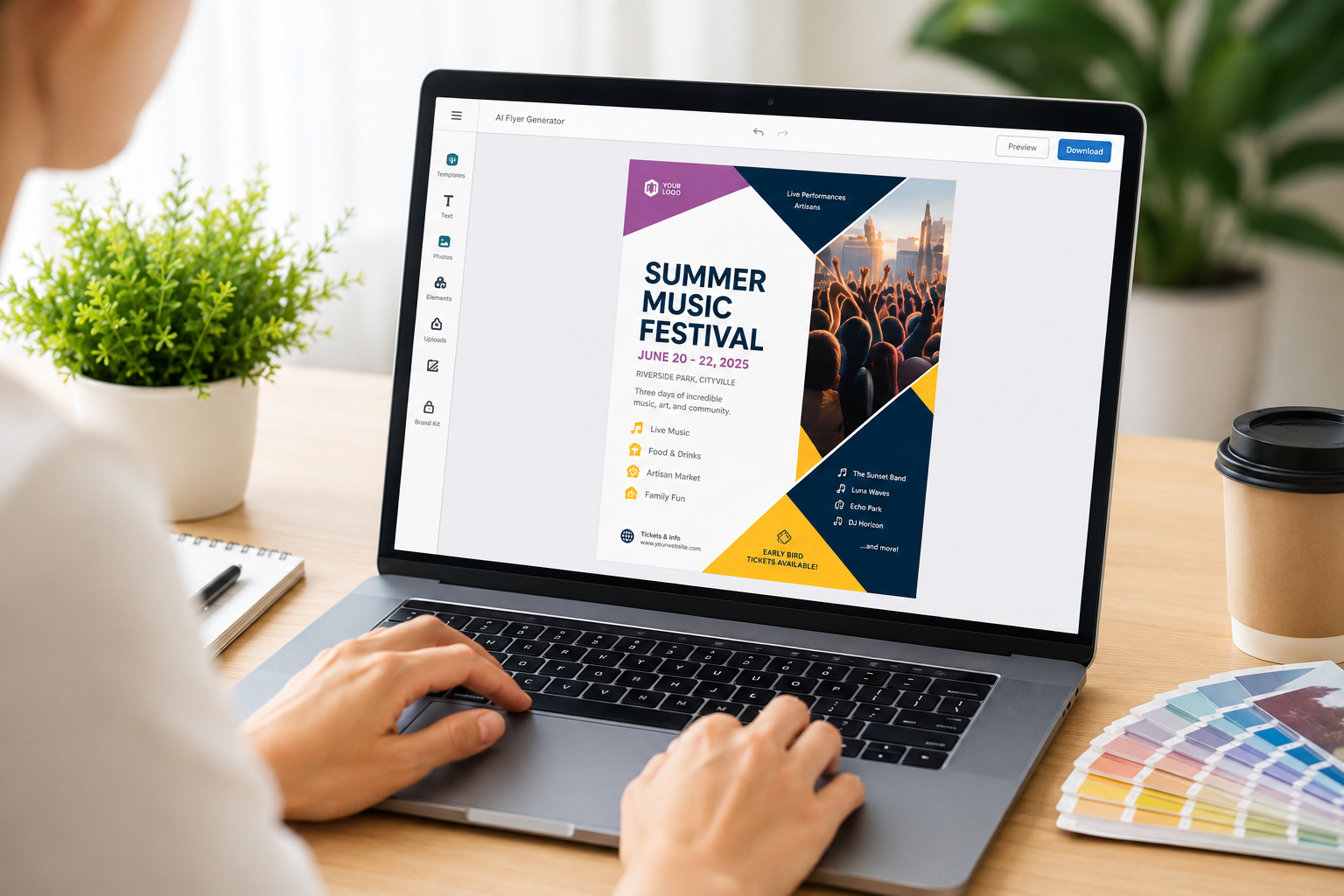
Chat Smith's Design Studio brings the whole hospitality workflow into one place. The AI Menu Generator handles the layout directly, and the AI Flyer Generator, AI Poster Generator and AI Logo Generator sit alongside it — which matters for a venue, because the menu, the window poster and the leaflet should share one visual language. There are companion guides for AI flyer prompts and AI poster prompts for the other formats.
It also runs several AI image models side by side, which matters for menus specifically: models vary a lot in how well they hold a clean grid and respect reserved empty space, and the one that keeps your columns aligned is rarely the first you try. Save the layouts that work as one-click templates so next season's menu starts from a structure rather than a blank page. Start with prompt 45 — run it on whatever you generate first and see how much more readable the menu gets when half the decoration goes.
AI menu prompts are text descriptions you give an AI image tool to design a restaurant or event menu, covering the layout, color theme, food style, and any decorative elements. Chat Smith's AI image generation tool can turn these prompts into menu design drafts.
The Chat Smith Editorial Team brings together AI enthusiasts, researchers, and creators to make AI accessible and practical. We share trends, tool reviews, and actionable guides that help individuals and businesses stay informed, boost productivity, and get more from AI.