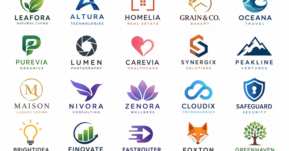
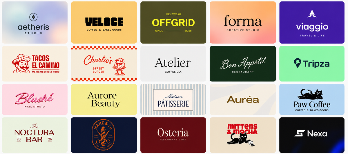
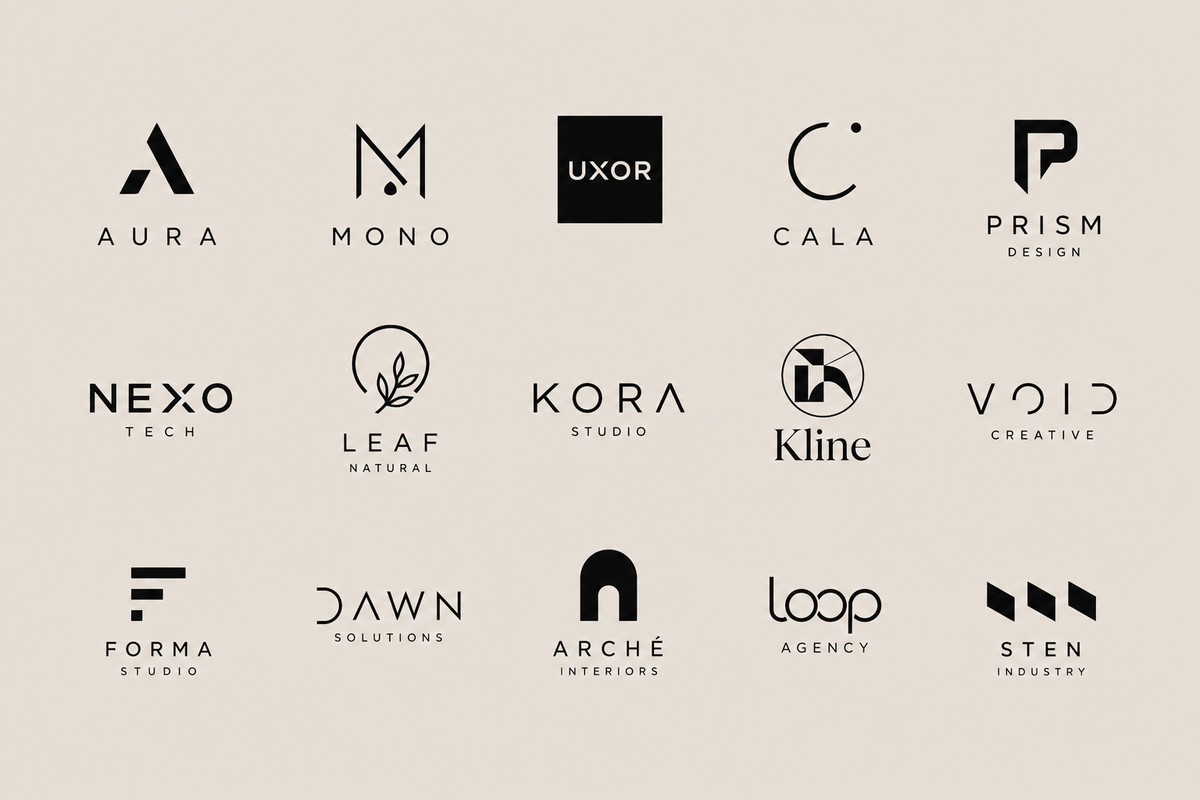
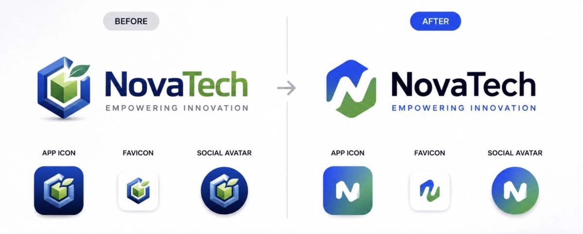
Ask a model for a logo and you will get a swoosh, a globe, a lightbulb, an abstract human figure, or a circuit pattern. Those five account for most AI logo output, and they arrive because the prompt asked for a category rather than an idea.
The fifty prompts below are written as briefs. Each names what the business does, the single idea the mark should carry, the form, the construction, the palette, and what to avoid. They are long for the same reason a design brief is long: the specificity is the work.
Most of them ask for concepts described in words rather than images, because that is what a text model is genuinely good at. A precise description a designer can sketch from is more useful than a picture you cannot scale. For generating the visuals afterwards, see our ChatGPT prompts for image generation, and the parent ChatGPT prompts guide covers technique across other work.
What Makes a Logo Prompt Work
One mark carries one idea. Trust, innovation and scalability is three ideas and produces a shape that expresses none of them. Name the single thing the mark must communicate and let the rest live in the brand.
Name the form. Wordmark, lettermark, pictorial, abstract or combination. Leave it unsaid and you get a picture next to some text every time, which is the least considered option of the five.
Specify the construction. Geometric or organic, stroke weight, open or closed counters, whether negative space is doing any work. This is the difference between a described concept and an adjective.
Demand that it works in one colour. A logo has to survive being stamped, embroidered, faxed and shown at sixteen pixels. Adding must work in solid black at small size rules out most of what would otherwise come back.
Ban the defaults explicitly. No swooshes, no globes, no lightbulbs, no circuit boards, no abstract people holding hands, no gradients. Every prompt below carries a version of this line and it is doing more work than any other clause.
A category with no idea in it:
Create some logo ideas for a bookshop cafe, something warm and inviting.
The same ask as a brief:
Propose four logo concepts for an independent bookshop that also serves coffee. Each must carry exactly one idea, and that idea must not be books or coffee. For each, specify the form (wordmark, lettermark, pictorial or abstract), the construction (geometric or organic, stroke weight, whether negative space is used), and one colour that also works in solid black. Avoid open books, coffee cups, steam, and anything that would suit any other bookshop equally well. Describe each precisely enough that a designer could sketch it without seeing an image.
Same starting point. The second one produces something a designer can price and build; the first produces five sentences you will read once.
Startup and Business Logo Prompts
Six briefs for young companies. The trap here is asking for trust, innovation and growth at once, which is why each of these names one idea and holds it.
1. Five concepts, one idea each
Propose five logo concepts for a product that helps small teams plan their week. Each concept must carry exactly one idea. For each, specify: the form (wordmark, lettermark, pictorial or abstract), the single idea it expresses, the construction (geometric or organic, stroke weight, whether negative space is used), and a two-colour palette that also works in solid black. Avoid swooshes, globes, lightbulbs, circuit patterns and abstract human figures. Describe each precisely enough that a designer could sketch it without seeing an image.
2. Built from the actual product
Here is what our product literally does, in one paragraph: [describe the mechanic, not the mission]. Derive four logo concepts from the mechanic itself rather than from the industry or the values. For each, state which part of the mechanic the shape comes from and why somebody would recognise it once told. Nothing abstract that could belong to any company in our sector.
3. Lettermark from the initials
Our company is called [name]. Design three lettermark concepts using the initials [letters]. For each: describe how the letterforms interlock or overlap, the stroke weight relative to the counter size, whether the join creates a secondary shape, and what happens to legibility at sixteen pixels. Monochrome only. Do not add a container shape such as a circle or shield.
4. Sustainability without the leaf
We are a sustainability-focused business doing [describe specifically]. Propose four logo concepts that communicate environmental care without using a leaf, a tree, a globe, a recycling arrow, or the colour green as the primary. For each, explain what carries the meaning instead and name a palette drawn from materials rather than from nature imagery.
5. Healthcare that is not a cross
Design four logo concepts for a healthcare service that [describe what it does and for whom]. It must read as competent and human at the same time, and it must not use a cross, a heart, a caduceus, a stethoscope, or a pair of cupped hands. For each concept, state which element carries competence and which carries warmth, and give a palette that avoids both clinical blue and pastel wellness tones.
6. Test it before you fall in love
Here is a logo concept I like: [describe it]. Stress-test it. Tell me how it performs as a 16-pixel favicon, embroidered on a shirt, engraved in one colour, printed at billboard size, and placed next to our three closest competitors' marks. For each failure, tell me the smallest change that would fix it and what that change costs the concept.
Prompt 2 is the one worth starting with. A mark derived from what the product actually does will outlast three rounds of positioning changes; a mark derived from this quarter's values will not.
Minimalist Logo Prompts
Six briefs for reduction. Minimal is not a style you request, it is a constraint you impose, so each of these sets a hard limit rather than an adjective.
7. A strict element budget
Design four logo concepts for [describe the business] using no more than three geometric elements each and exactly one colour plus white. For each concept, list the elements, their proportional relationship, and the single idea the arrangement communicates. If a concept needs a fourth element to work, say so rather than adding it quietly.
8. Negative space doing the work
Propose three logo concepts for [business] where the meaning is carried by negative space rather than by the drawn shape. For each: describe the positive shape, describe what appears in the gap, and explain how obvious it should be on first viewing versus second. Warn me if the effect only works above a certain size.
9. One continuous line
Design three logo concepts for [business] that can each be drawn as a single unbroken line of constant weight. Describe the path of the line from start to end, where it crosses itself if it does, and the shape it encloses. State the minimum stroke weight at which each still reads at small size.
10. Wordmark, typography only
Create four wordmark concepts for the name [name] with no symbol at all. For each: name the typeface category (geometric sans, grotesque, humanist sans, transitional serif, slab), the one letterform that gets a custom modification, what that modification is, and the letter spacing relative to normal. Explain what each choice signals about the company.
11. Reduce something complicated
Here is a complicated brand idea: [describe it in full]. Reduce it to a mark in three stages. Stage one: the idea in a sentence. Stage two: the idea as a single visual metaphor. Stage three: that metaphor as three geometric elements. Show all three stages so I can see what was lost at each step and decide whether the loss was acceptable.
12. Take one thing away
Here is my current logo concept: [describe it]. Remove one element at a time and tell me, at each removal, whether the mark still communicates its idea. Continue until removing anything further breaks it. Tell me which version is the strongest and why the extra elements were there in the first place.
Prompt 12 is the most useful editing tool on the page. Almost every first concept has one element in it that was added out of nervousness rather than necessity.
Personal Brand Logo Prompts
Five briefs for marks that represent a person. The constraint nobody states: it has to still work when you change what you do, which most personal marks fail at within two years.
13. A mark that survives a pivot
I am building a personal brand around [describe what you currently do]. Design four mark concepts that would still make sense if I moved into [name a plausible adjacent field]. For each, state what the mark is anchored to - a value, a method, my initials, or a visual habit - and explain why that anchor is more durable than my current job title.
14. Initials without a monogram cliche
My initials are [letters]. Design three lettermark concepts that avoid the standard approaches: no interlocking script, no circle enclosure, no letters stacked in a square, no serif monogram. For each, describe the specific structural idea that makes it distinctive and how it behaves at profile-picture size on a dark background.
15. Signature made usable
I want to use a signature-style wordmark for [name]. Describe how to build one that stays legible: which letters to simplify, where to break the connection between letters, the minimum stroke weight for small sizes, and how much slant is too much. Also tell me the two situations where a signature mark is the wrong choice.
16. One visual habit, used everywhere
Instead of a symbol, I want one repeatable visual habit that identifies my work across a website, slides, a newsletter and video thumbnails. Propose four options - for example a specific rule weight, a consistent crop, a single accent colour used in one place, or a recurring shape. For each, describe exactly how it would appear in each of those four contexts.
17. Does it sound like me
Here are three things people consistently say about how I work: [list them]. Here is a mark concept I am considering: [describe it]. Tell me honestly whether the mark expresses any of those three things or whether it expresses something more generic. If it is generic, say which of the three would be hardest to express visually and why.
Anchor a personal mark to a method rather than a role. Roles change every few years; the way somebody works usually does not.
Luxury and Premium Logo Prompts
Five briefs for the register that is easiest to get wrong. Luxury reads as restraint and precision, not as gold and serif, and asking for premium usually returns exactly the two things that undermine it.
18. Restraint rather than ornament
Design four logo concepts for [describe the brand and price point] that read as expensive through restraint alone. No gold, no metallic effects, no crest, no laurel, no monogram in a circle. For each, specify the typeface category, the letter spacing, the amount of clear space around the mark, and the single detail that signals care. Explain what each detail signals and to whom.
19. The wordmark and nothing else
Create three wordmark concepts for [name] in the register of a heritage brand, using typography only. For each: name the typeface category, describe the one custom letterform adjustment, specify the tracking, and state the ratio of cap height to overall lockup width. Do not add a symbol, a container, or a tagline.
20. Premium without heritage
We are a new brand at a premium price point with no history to borrow from. Propose four marks that earn the price without pretending to be old. Avoid anything that implies a founding date, a family name, or a European tradition we do not have. Explain for each what makes it feel considered rather than expensive-looking.
21. How it behaves on the product
Here is a mark concept: [describe it]. Our products are [describe materials and finishes]. Describe how this mark should be applied in each of: blind embossing, foil, engraving, screen print on fabric, and a small metal tag. For each, state what has to change about the mark and where it would fail entirely.
22. The tell that gives it away
Here is our mark: [describe it]. Tell me the specific details that would make somebody familiar with premium brands read this as trying rather than being. Be blunt about it. Then tell me which of those details is cheapest to fix and which is structural.
Ban gold and serif in the prompt itself. Both can work, but requesting them is how you end up with a mark that looks like every other brand asking to be taken seriously.
Five briefs for marks with more room to move. The discipline that keeps them from becoming decoration: an expressive logo still has to reproduce, so every one of these names a reproduction constraint.
23. Reference a tradition, not a person
Design four logo concepts for [describe the business] drawing on a named design tradition - for example Bauhaus geometry, Swiss typographic style, mid-century American signage, or Japanese family crests. Do not imitate any living designer or existing brand. For each, name the tradition, the two specific conventions you are borrowing, and what you are deliberately leaving behind.
24. Hand-drawn that still reproduces
Propose three logo concepts for [business] that read as hand-made without becoming unusable. For each: describe the mark, the specific irregularity that signals the hand, the minimum size at which that irregularity still reads, and what happens to it in single-colour print. Reject any idea that only works above a certain size.
25. A system, not a single mark
Design a flexible identity for [business] where the mark changes across contexts but stays recognisable. Define the fixed element, the variable element, and the rule that connects them. Then describe five specific variations and state what would break the system if somebody applied it carelessly.
26. Built from a material
Our business works with [name a physical material or craft process]. Derive four logo concepts from the behaviour of that material rather than from a picture of it: how it folds, breaks, joins, wears or catches light. For each, describe the shape and explain which property of the material produced it.
27. Expressive but not dated
Here is an expressive mark concept: [describe it]. Tell me which elements of it are tied to current visual fashion and would look dated within three years, and which are structural and would not. For each fashionable element, suggest a more durable alternative that keeps the same energy.
Name a tradition rather than a brand you admire. A tradition brings rules you can apply; imitating a specific company brings a resemblance you will have to defend.
Tech and AI Logo Prompts
Six briefs for the most crowded visual category there is. Every one of these bans the defaults, because tech logos converge harder than any other sector and the convergence is entirely avoidable.
28. Everything banned that everyone uses
Design five logo concepts for [describe the product] without using: a circuit pattern, a node-and-line network, a hexagon, a chat bubble, an abstract brain, a neural mesh, a gradient from purple to blue, or a lowercase geometric sans wordmark. For each concept, name the idea it carries and explain why it could not be reused by a competitor in the same sector.
29. Derived from the architecture
Here is roughly how our system works: [describe the actual architecture or data flow in plain terms]. Derive four marks from that structure. For each, state which part of the system the shape represents and whether an engineer on our team would recognise it. Nothing that merely gestures at technology in general.
30. Warm rather than clinical
Our product is technical but our users are not. Design four marks that read as approachable without becoming childish. For each: specify the corner radius, the stroke weight, the palette, and the one element that provides warmth. Avoid rounded mascots, smiling shapes, and pastel gradients.
31. Works as an app icon first
Design three marks for [product] where the primary use is an app icon in a crowded home screen. For each: describe the shape at 60 by 60 pixels, the figure-to-ground contrast, how it reads against both a light and a dark wallpaper, and what distinguishes it from the three most visually similar apps in its category.
32. A monogram that is not a hexagon
Our name is [name]. Design three lettermark concepts using [letter or letters] that avoid every standard tech container: no hexagon, no rounded square, no shield, no circle. For each, describe how the letterform itself creates a distinctive silhouette and what happens to that silhouette when it is filled solid black.
33. Check it against the field
Here is our mark concept: [describe it]. Here are our six closest competitors and what their marks look like: [describe them]. Tell me honestly whether ours would be distinguishable from the set at a glance, which competitor it is closest to, and what single change would create the most separation.
Run prompt 33 before you commit to anything. Tech marks fail from resemblance far more often than from bad design, and resemblance is only visible when you put them side by side.
E-commerce and Product Logo Prompts
Five briefs where the mark has to survive contact with packaging, marketplaces and other people's templates. Reproduction constraints matter more here than anywhere else on this page.
34. Designed for the shelf
Design four logo concepts for [describe the product] that will sit on a physical shelf beside [describe the competing products]. For each: describe the mark, the colour that separates it from the shelf, how it reads from two metres away, and how it reads in a 200-pixel marketplace thumbnail. State which of those two conditions each concept optimises for.
35. One mark, a range of products
We sell [describe the range, including the most and least premium items]. Design a mark that works across all of it. Describe the fixed element, how it is applied to the entry-level product versus the premium one, and what must not change between them. Tell me where the range is too wide for one mark to hold.
36. Survives other people's templates
Our mark will appear inside marketplace listings, third-party ads and retailer sites where we control nothing. Propose three concepts that hold up when cropped to a square, placed on a white background, shrunk to a favicon, and reproduced with the wrong colours. For each, name the property that gives it that resilience.
37. A mark and a stamp
Design a primary mark for [business] plus a simplified secondary version for small applications: care labels, seals, stickers and stamps. Describe both, state exactly what is removed in the secondary, and give the size threshold at which we should switch from one to the other.
38. Colour that survives print
Here is our mark and intended palette: [describe]. Tell me which colours will shift noticeably between screen, coated stock, uncoated stock and kraft card. For each problem colour, suggest an adjustment that keeps the character, and tell me which single colour should be treated as the brand colour if we can only guarantee one.
Design the small version first. A mark that works as a care label will scale up cleanly; one designed at poster size rarely survives being reduced.
Industry-Specific Logo Prompts
Six briefs for sectors with strong visual conventions. Each names the cliche it is avoiding, because in a conventional sector the obvious symbol is already taken several times over.
39. Food and drink without a fork
Design four marks for [describe the food or drink business] without using cutlery, a chef's hat, a wheat sheaf, a coffee bean, or a plate seen from above. For each, state what carries the appetite appeal instead, and give a palette that avoids both the standard warm red-and-cream and the standard artisan brown-and-cream.
40. Law and finance without a pillar
Design four marks for [describe the professional services firm] that communicate reliability without a pillar, a shield, scales, a lion, or navy-and-gold. For each, explain what signals reliability instead - it may be proportion, symmetry, weight, or spacing rather than a symbol - and how it avoids reading as cold.
41. Property without a roofline
Design four marks for [describe the property business] avoiding house outlines, rooflines, keys, doors and skylines. For each, name the idea it carries about the business rather than about buildings, and explain how it would work on a board outside a property as well as on a phone.
42. Education without a graduation cap
Design four marks for [describe the education business and the age group it serves] without a mortarboard, an open book, a pencil, an apple or a lightbulb. For each, state which idea about learning it carries and check that the idea suits the specific age group rather than education in general.
43. Fitness without a figure
Design four marks for [describe the fitness business and who it is for] without a running silhouette, a dumbbell, a flexed arm, a heartbeat line, or an italicised sans serif. For each, explain what conveys effort or progress instead and whether the result would appeal to somebody intimidated by gyms.
44. Find the convention first
Before designing anything, list the visual conventions of [name the sector]: the symbols, colours, typefaces and layouts that most brands in it use. Then tell me which conventions carry genuine meaning to customers and which are simply inherited. Only then propose three marks that keep the first group and break the second.
Use prompt 44 before the rest of this section. Some conventions exist because customers rely on them, and breaking those is a different decision from breaking the ones that are simply copied.
Rebranding and Redesign Prompts
Six briefs for changing a mark that already exists. The hardest question in a rebrand is what to keep, and it is the one most rebrands answer by accident.
45. What is worth keeping
Here is our current logo: [describe it in detail]. We have used it for [duration] and customers describe our brand as [list what they say]. Identify which elements of the mark are carrying real recognition and which are simply old. For each element, tell me the cost of losing it and whether that cost is recoverable.
46. Evolution rather than replacement
Here is our current mark: [describe it]. Propose three levels of change: a light refresh that existing customers would barely notice, a moderate evolution that keeps the silhouette, and a full redesign. For each, describe exactly what changes, what stays, and what we would gain and lose. Recommend one and defend it.
47. Why it stopped working
Here is our mark: [describe it]. Here is how the business has changed since it was made: [describe]. Diagnose specifically why it no longer fits - whether the problem is the symbol, the typography, the palette, the proportions, or simply that it now says something we no longer do. Do not propose a new design yet.
48. Modernise without erasing
Our mark is [describe] and dates from [period]. Modernise it while keeping the elements customers actually recognise. Describe the specific adjustments - stroke weight, counter size, corner treatment, spacing, palette - and for each explain whether it is a correction of a flaw or a concession to current fashion.
49. The rollout nobody plans
We are changing our logo from [describe old] to [describe new]. List everywhere the old mark exists that we will forget: signage, invoices, email signatures, app icons, packaging in transit, third-party listings, printed materials already distributed. For each, tell me whether it must change immediately, can change on next reprint, or can be left. Then write the one-paragraph explanation we should give customers.
50. Argue against the rebrand
We are planning to rebrand because [state your reasons]. Make the strongest possible case that we should not do this. Include what the change will cost in recognition, money and internal time, and whether the underlying problem is one a new logo actually solves. Be direct - I would rather hear this now.
Prompt 50 is not a formality. A surprising number of rebrands are attempts to solve a positioning or product problem with a drawing, and finding that out early saves a great deal.
From an AI Concept to a Logo You Can Actually Use
This is the part most logo prompt articles leave out, and it is the part with real consequences. Everything above produces concepts. A concept is not a logo, and four things stand between the two.
A generated image is not a deliverable. Image models produce raster files. A logo needs to be vector so it can scale from a favicon to a vehicle without softening, and so it can be recoloured, outlined and cut. Expect to have the chosen concept redrawn properly.
Do not trust generated lettering. Text inside AI images is frequently misspelled or malformed, and a wordmark is the one place that cannot be tolerated. Set the type yourself in a real typeface, and check the licence covers commercial use.
Run a trademark search before you commit. A model can produce something close to an existing registered mark without either of you knowing. Search your national trademark register for your classes, and get professional advice before spending on signage, packaging or a print run.
Check what you can own. The copyright status of purely AI-generated work varies by jurisdiction and is actively changing, and human authorship generally matters. For a logo you may need to defend, that is worth understanding before launch rather than after. Treat the AI output as a starting point that a person then designs from.
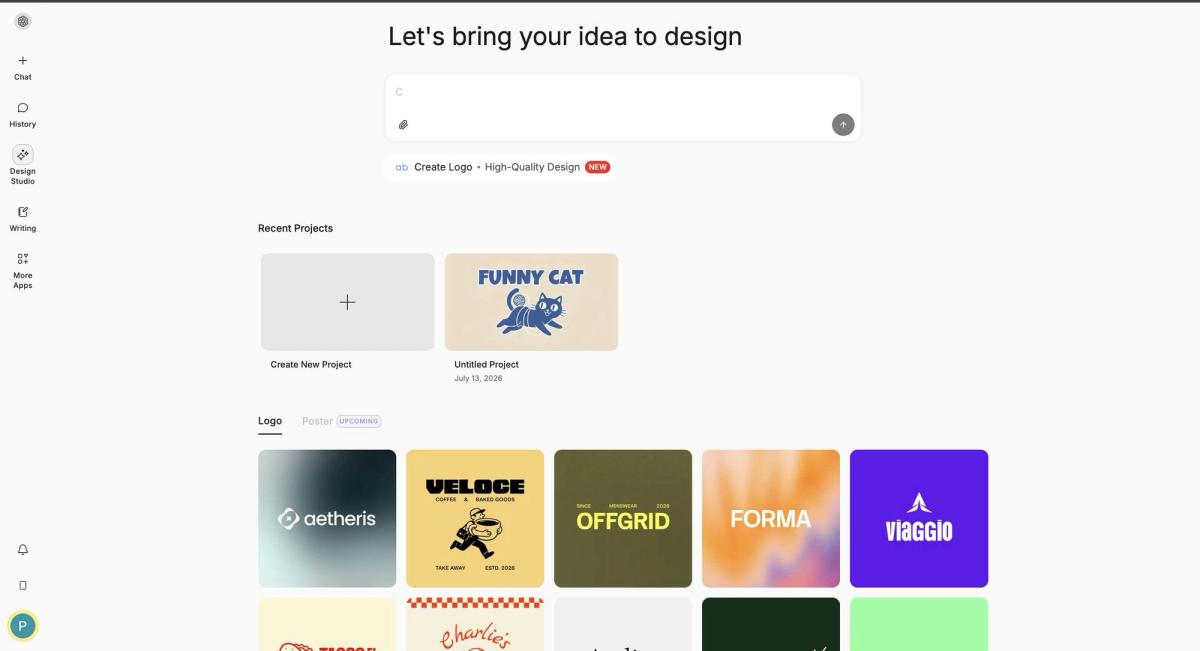
None of this makes the prompts less useful. It changes what they are for: generating and pressure-testing directions quickly, so that the expensive human work starts from a good place rather than a blank page. If you would rather begin from something already built, the logo templates in Design Studio are ready to use or edit, which removes the redraw step entirely. Take the strongest concept from the briefs above, find the template closest to it, and adapt that instead of starting again.
Using These Logo Prompts in Chat Smith
Work in two passes. Use a text model for the briefs above to get concepts described precisely, then take the two or three you like into an image model to see them. GPT Image 2.0 and Nano Banana handle marks differently, so it is worth putting the same description through both. An AI logo generator takes a description directly if you would rather skip the chat step.
Change one line per attempt. If you rewrite the form, the palette and the construction together you will not know which change helped. For the wider identity around the mark, our ChatGPT prompts for branding go further, and AI image prompts cover the general craft of describing a picture. Chat Smith is free to try.
And the test that settles most arguments: draw the concept from memory an hour after you first saw it. A mark you can reproduce roughly from memory is working. One you cannot is decoration, however good it looked on the screen.
ChatGPT prompts for logos are text descriptions that ask an image model to generate a logo concept: a symbol, a style, a colour palette and a background. They work best as a fast way to explore directions, not as a source of a finished brand mark.
The Chat Smith Editorial Team brings together AI enthusiasts, researchers, and creators to make AI accessible and practical. We share trends, tool reviews, and actionable guides that help individuals and businesses stay informed, boost productivity, and get more from AI.